


Inside the Nook: The allure of amber
Learning to love a colour you loathe

I’ll admit it upfront (and possibly alienate some of you) I’m not a fan of orange. While many associate it with warmth and joy, I’ve always found it a bit too loud for my taste. Lately, I’ve softened towards it when it is deeper or rust-toned but you still won’t catch me painting my walls with it. However, turn orange translucent, and suddenly we have amber, which is rich, honeyed, and full of depth and its beginning to warm on me!
My First Encounter with Amber
My introduction to amber wasn’t in interiors but in jewellery. In the early 2000s, while visiting family in Warsaw, my aunt took me on a tour of the jewellery shops. Every window gleamed with golden-hued gems, and at thirteen, I was mesmerised. Amber was everywhere, incorporated into nearly every piece from necklaces, to pendants to bangles and rings. I couldn’t resist bringing home a silver spiky ring with an amber sphere, my first piece of amber.
What is Amber?
Amber isn’t a gemstone but fossilised tree resin, making it nature’s own time capsule. What I didn’t realize then was that Poland is one of the world’s amber hotspots. As Culture.pl explains:
"Poland's rich amber deposits are primarily due to the vast forests that existed in the region millions of years ago. Over time, the resin from these ancient trees hardened and transformed into amber, which is now found along the Baltic coast. Gdańsk, a city on Poland's Baltic Sea coast, is often referred to as the world's amber capital."
I think that this is also a reason why I like amber. Orange for me is not a colour that I normally see as a ‘natural’, it reminds me of Sainsburys, easyJet and B&Q - ‘value brands’, not a feeling I would want to exude in my home. However in this translucent form, it seems natural, more like honey which makes me feel far more relaxed, and less ‘hit in the face’ by a colour. Appreciating that brands need to get your attention, but how much more relaxing is this logo to look at than the stark orange original?!

Bringing Amber Into the Home
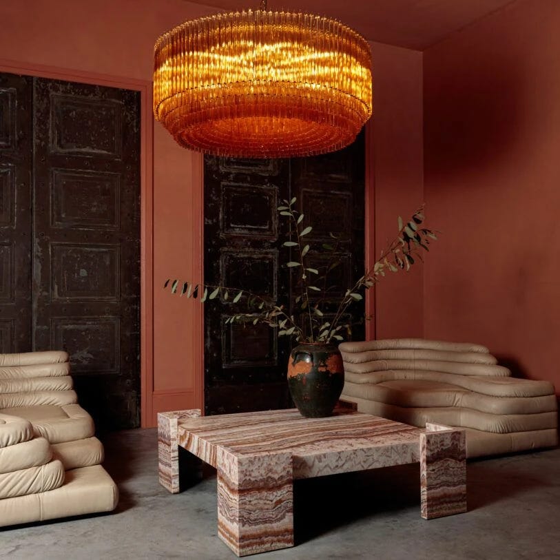
How can you bring these warm, honeyed hues into interior spaces? Architects have long used amber-tinted glass in commercial spaces on walls, pillars, and partitions to create a rich, inviting glow.
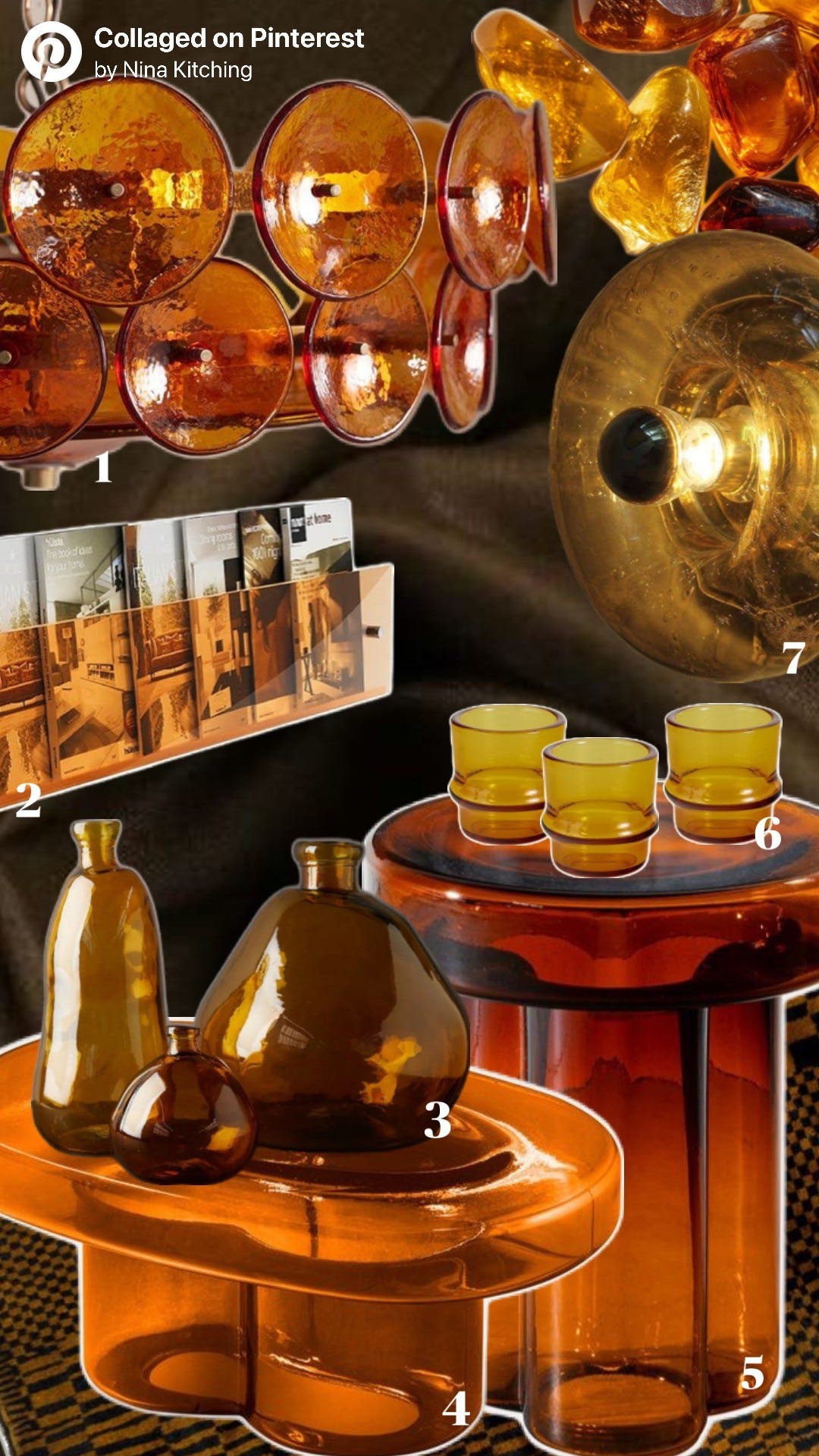
One of my favorite ways I have seen it used at home is through lighting. Amber glass chandeliers and wall lamps cast the most beautiful warmth light into rooms, transforming a space entirely, Pure White Lines have some beautiful ones! It’s perfect for cozy, dimly lit rooms designed for unwinding, think lounges, reading nooks, or anywhere you’d curl up with a book or a drink in hand.
To complement amber glass in an interior scheme, consider pairing it with:
Earthy Tones – Rust, terracotta, ochre, and deep olive for a natural, cosy feel.
Moody Shades – Charcoal, deep brown, and navy for a dramatic contrast.
Metallic Accents – Brass, gold, bronze, and copper to enhance amber’s glow.
A Touch of Nostalgia
Amber glassware had its heyday in the mid-century, and it’s making a stylish comeback. Designers are blending its vintage charm with contemporary aesthetics, making it feel both nostalgic and fresh.
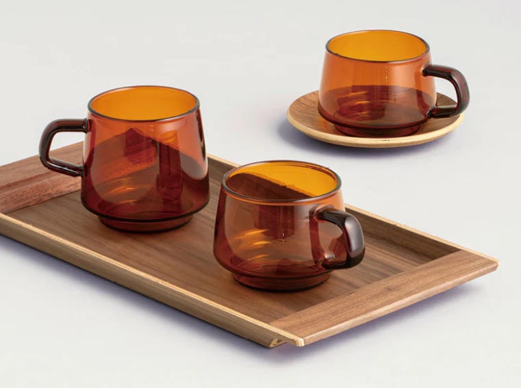
I decided to dip my toe into amber with these Kinto coffee cups and I have to say, I’m loving them. The warm, golden tones pair perfectly with a morning brew, making every sip feel just a little cosier.
Amber has just about persuaded me to love a colour that I loathe and perhaps there are colours you don’t like, but maybe you just need to look at them in a new light!
reminds me of the Orange Nesso lamp for Artemide
I look forward to seeing more of it used, particularly as a contrast to blue and green hues.
I hope one day someone solves the mystery and finds the long lost “amber room”. That would be something to see!